Uniform Tweaks: Celtics, Hawks, and Bulls
Posted by Neil Paine on April 12, 2010
Over at Uni Watch, Paul Lukas has been posting some fun "uniform tweaks", new uniform concepts for (mostly baseball) teams. He has presented some basketball ones, of course, but since I created a ton of NBA & CBB uniform re-creations in MS Paint a long time ago, I thought I'd try my hand at some tweaks, redesigns, and "fauxbacks" (aka "a retro-ish uniform that is clearly meant to evoke a particular design from the past but does not quite duplicate that design faithfully, sometimes due to laziness or inattention to detail, sometimes intentionally") in an ongoing series here at the blog. Some of them will be bad, I admit that going in. But some of them will hopefully be cool, or at least different. And if you have any of your own, I'd love to post them as well, so hit me up with an e-mail and send me what you've got.
Today, I wanted to kick things off with a couple of "fauxbacks" for the Hawks and Celtics....
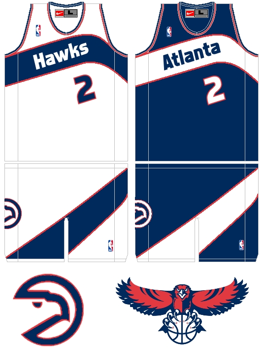
This is a Hawks one I did a while ago. I always liked their 1980s "Pac Man" logo and the Dominique Wilkins-era uniform style, but I'm not a huge fan of the gold and red color scheme they sported before upgrading to the much better navy/red/white scheme they sport today. I think the current Hawks uniform is one of the best-looking ones in the league (except for their red alternate, which is terrible), but I wouldn't mind seeing a modern re-imagining of the 1980s unis, using their current color scheme. The font I used above isn't really important, you can sub in any number of similar ones for the same effect, but I like the general concept. This is what a "fauxback" is all about.
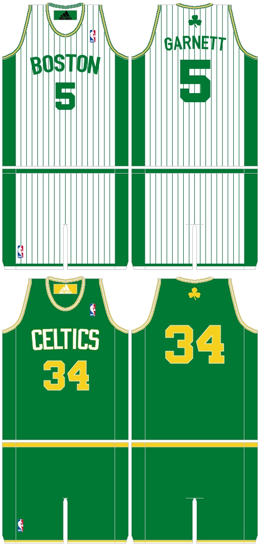
It's tough to do anything to a classic like the Celtics' uniform, which has essentially gone untouched for more than 60 years. I feel like Tommy Heinsohn would have a stroke if the C's ever wore something like this, so we're left to work with more traditional design elements. I normally hate pinstripes on basketball jerseys, but I like what the Bobcats have done with them this season, and I always thought the Pacers' late-90s/early-2000s design was pretty underrated, so why not try them with the Celts? (I know, pinstripes and Boston have a bad history, but maybe we can work past those differences.) The other tweak was to incorporate gold/yellow, which was a part of the Celtics' original color scheme, into the design (Boston already uses an old gold variant in the St. Patrick's Day unis, so this wasn't a huge stretch). The results are... okay. The bottom one has a 1980s Jazz vibe, but I could at least see the Celtics taking the court with these and not looking ridiculously out of place.
Finally, here's your insane uniform remix of the day. The home one isn't really that crazy, it's basically a minor tweak of their 1974-85 road uniform, applying it to the home white design. But on the right... whoa. Whenever I do a redesign, I like to look at a city's flag for an alternate color scheme, and Chicago's flag features red, white, and baby blue. That was the starting point, and then I came across an alternate "Bulls" logo here that was a pretty good fit for a redesign like this. Add some "Pointedly Mad", and suddenly you have a radically new Bulls uniform design. Now, can I see Michael Jordan wearing that, ever? Probably not. And it's probably more D-League-ish than you'd like to see in the NBA, but it still turned out better than I thought a baby blue Bulls uni with a drastically changed wordmark and logo could be.
(Uni Template can be downloaded here... Want to submit your own uniform redesign? E-Mail me and I'll include them in a future post!)


April 12th, 2010 at 2:36 pm
What program are you using to design these with?
The Hawks alts (both) and the Celtics pinstripes are very cool, btw.
April 12th, 2010 at 3:32 pm
Pac-Man logo rules.
April 12th, 2010 at 3:35 pm
Believe it or not, but a lot of it is done in MS Paint. I do the uniform fonts and re-size logos, etc. in Paint Shop Pro X, but I start with a blank template BMP in Paint and overlay everything on top of that. It's a lot cleaner that way, and I can flood fill the colors w/o any messiness.
I uploaded the template here, to make it easier for anyone else to make their own:
http://www.megaupload.com/?d=B6GK7H10
April 12th, 2010 at 3:47 pm
I love the Hawks "fauxback" but to me the Hawks will always be red and yellow. Too many other teams are blue and red, so why not be different?
April 12th, 2010 at 7:53 pm
The problem with red and yellow as a matched pair is not that they are unique, but that they suck ass. The Rockets had the good sense to pitch those old McDonald's unis along with that hideous font they used. Atlanta had the same wretched color scheme, but the uniform design looked good. I do agree that the Hawks should have used some other color scheme; there just isn't enough purple in the NBA. (Laker purple is more of a bluish-violet; even the Suns purple isn't quite a true purple) A metallic gold would be good in some capacity.
IMO the Wizards have the best color scheme in the NBA. The "Wizards" on the jersey front is horrible, but everything else on their unis is nice.
April 12th, 2010 at 8:12 pm
I have an old silver Bucks alternate "fauxback" I did. Maybe I'll send that your way.
April 12th, 2010 at 9:38 pm
the pinstripes are atrocious. It'd be a travesty of epic proportions to screw with the Celtics unis like that. The Hawks design is pretty sharp, though.
Disagree with Ricardo on the red/yellow. The old Hawks unis were fantastic, and I think the 80s Rockets unis were great. Really classic look and they weren't too busy. They've been tripping all over themselves every since the mid 90s pinstripes debacle. When will teams learn? No pinstripes. Ever. The only pinstripe jersey I didn't hate were the black and red Bulls, but they were still a downgrade versus the classic Bulls unis. Basketball jerseys lend themselves to simplicity. Pick a nice color scheme and keep the design simple. It's no wonder that all the best uniforms today are classics from yesteryear. Celtics, Lakers, Knicks, Pistons, Bulls, Sixers (now that they've gone back), Clippers. It's the teams that keep tinkering that keep screwing it up (wizards are probably the worst with this.. remember that tri-tone block design?).
Also, the Kings jerseys are entirely purple, fwiw.
April 12th, 2010 at 11:50 pm
as a new englander transplanted in nyc, i find those pinstripes horribly offensive. you owe me a coke, neil. well a coke zero. i gotta watch my weight cause i can't wear slimming pinstripes.
April 13th, 2010 at 12:17 am
I forgot the Kings only because everyone else has.
April 13th, 2010 at 12:24 am
Wow, I guess I should have been more sensitive to the delicate tastes of my fellow Celtic fans!
April 21st, 2010 at 8:07 am
I like the Hawks one. Not so big on the other 2.
May 1st, 2010 at 11:07 pm
the bulls in lt blue is awful and C's in pinstripes is terrible but i love the hawks jerseys toatally makes up for the other 2
May 26th, 2010 at 12:39 am
I didnt think the celtics were washed up but I didnt think they'd dominate this bad.